
ALBANY INTERNATIONAL AIRPORT
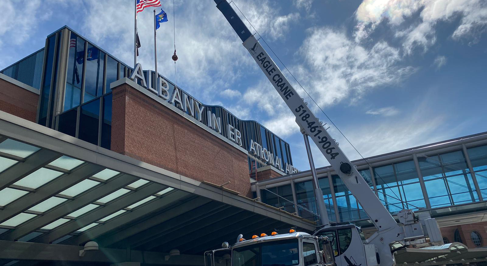

CMI worked closely with C&S Architects to achieve a comprehensive wayfinding and signage design that included digital technologies and integrated brand elements for Albany International Airport (ALB). The crowning aspect of the project was the 44-inch high illuminated letters of the airport name on the parapet of the main entrance to the airport that can be seen from miles around.
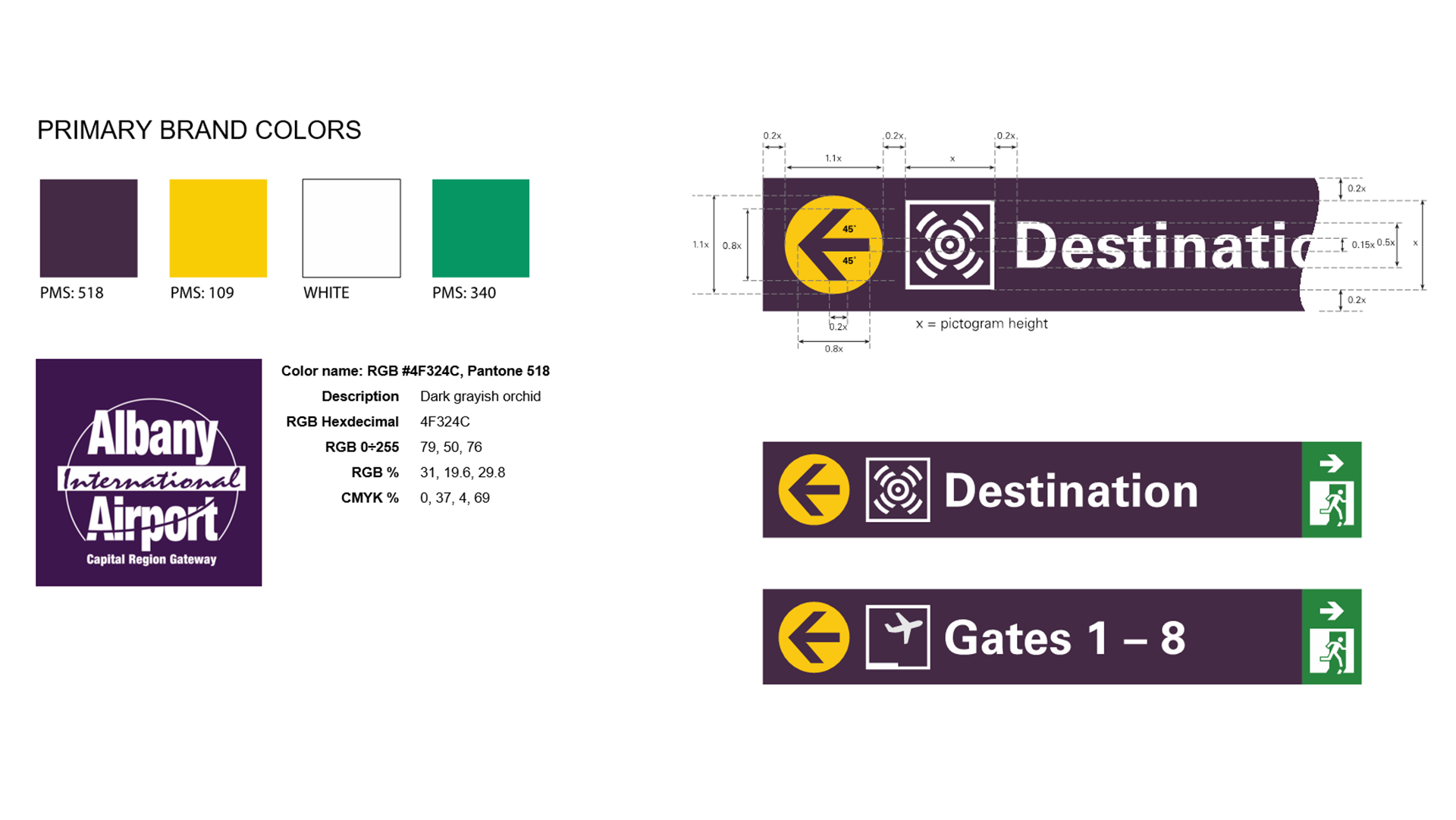
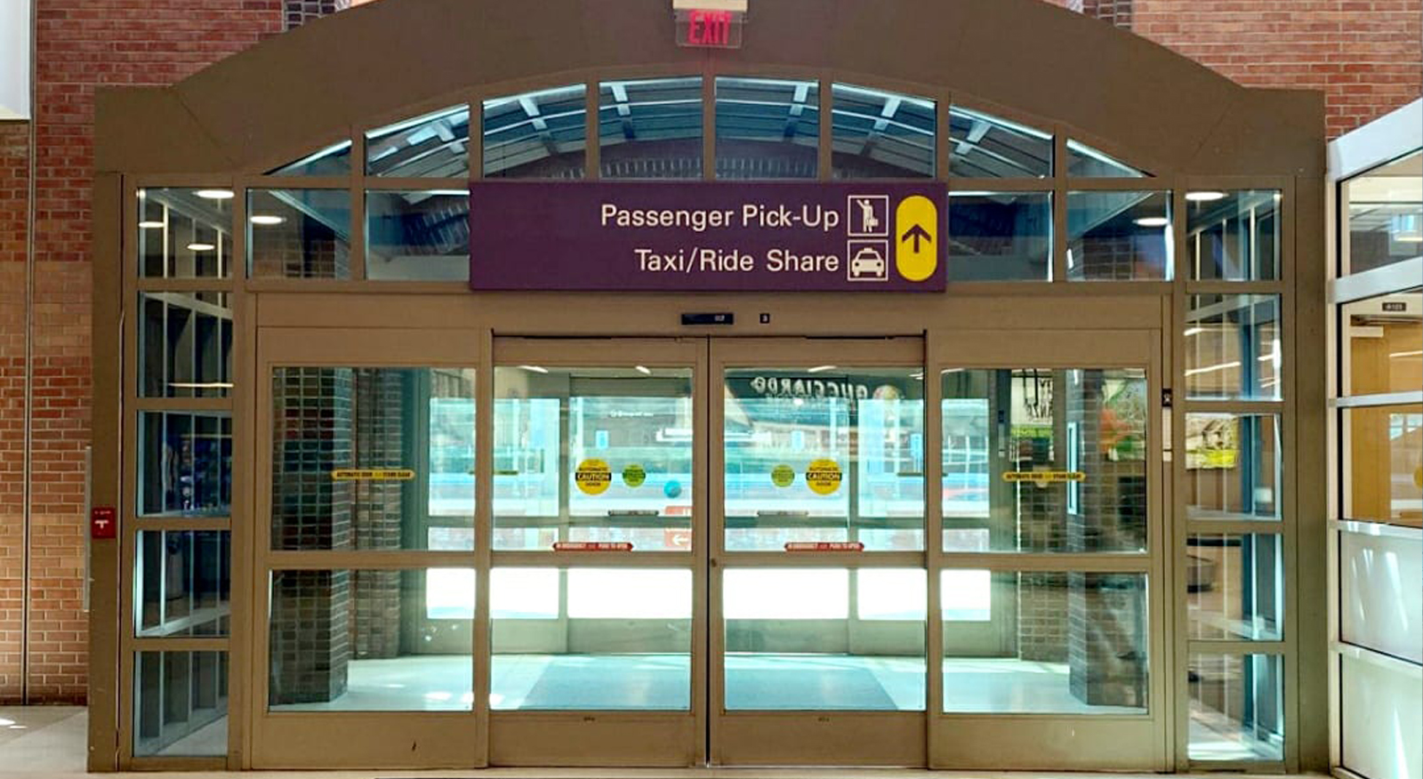
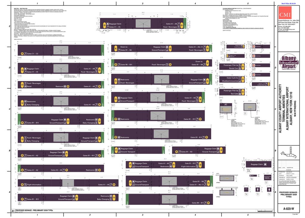
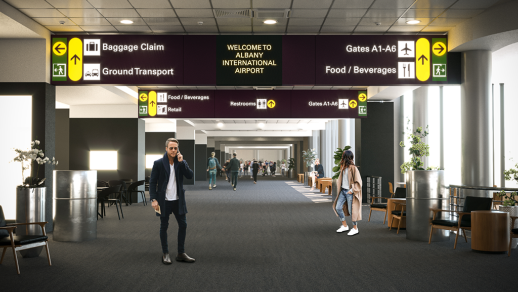
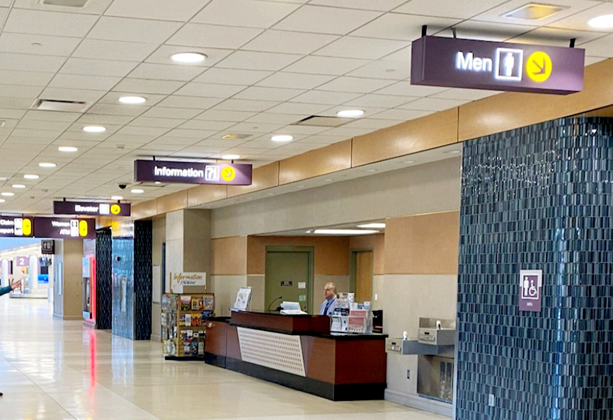
The signature color scheme was incorporated into the design solution, which included enlarged font and international symbols, a simplified arrow scheme that reduced the amount of arrows for signs with multiple lines and arrows in the same direction by putting the arrow in one large lozenge shape. Retrofitting the signs with LED lighting contributed to 40% savings in electricity over 5 years.
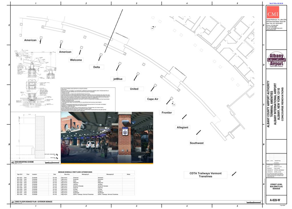
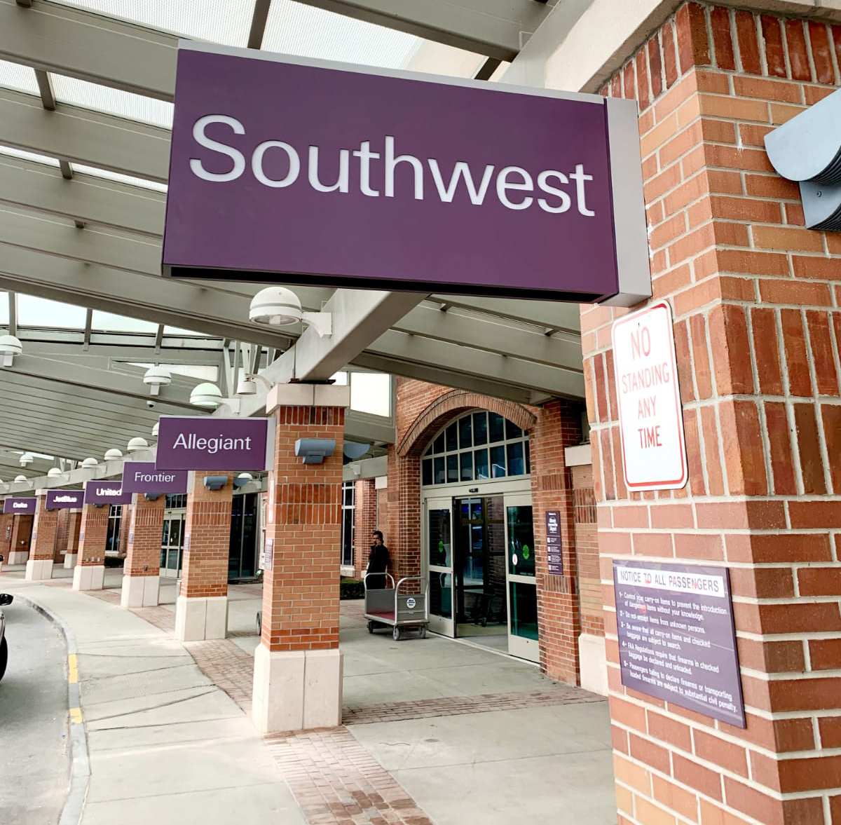
There were few as-built drawing references to help us with the renovation design and specifications of the signage. CMI worked closely with the ALB team to document all the existing signs for demolition and / or replacement, including a lodging / transportation kiosk and ground transportation, ticketing area and curbside signage messaging.