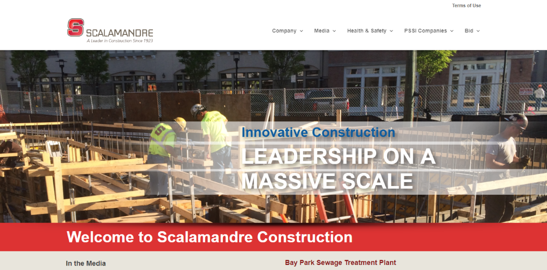
Scalamandre Construction
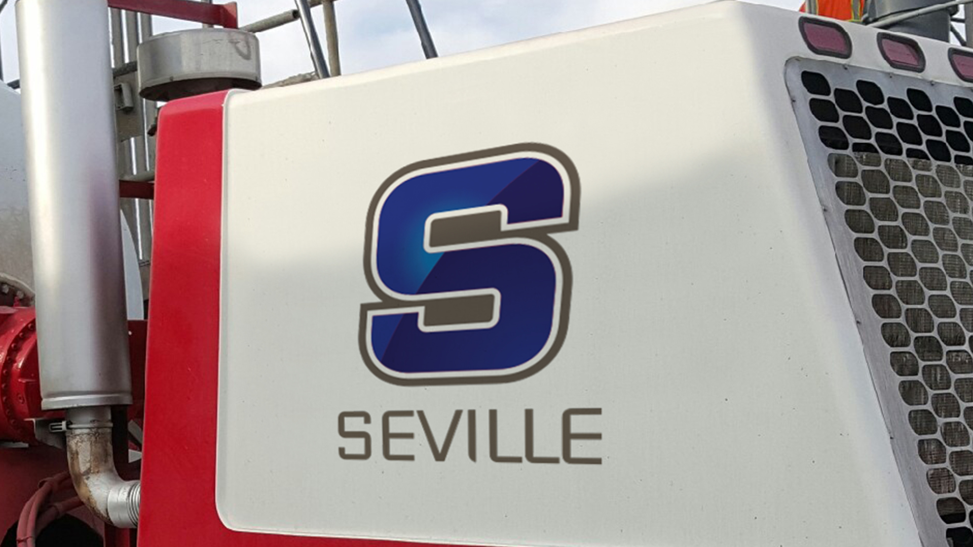
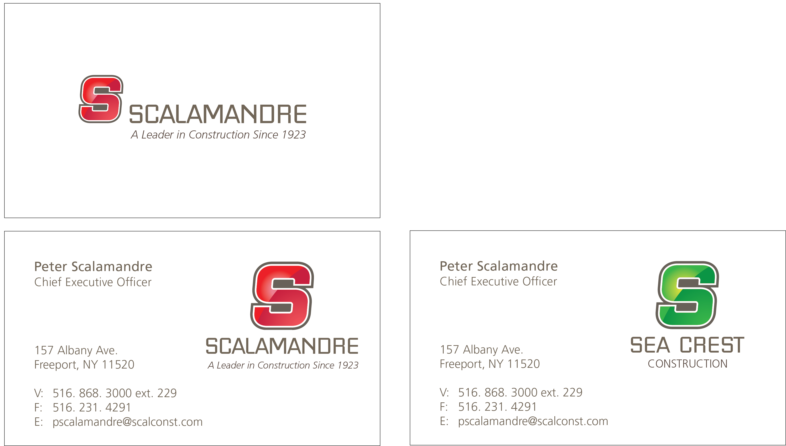
PSSI had out-grown their existing site and needed a new, responsive site that kept up with technology and represented our updated brand. PSSI recently revitalized its brand to make the S-monogram more contemporary and colorize it to better define the PSSI companies: PSSI, Sea Crest Construction, Sea Crest Development, Seament Transportation, Seville Central Mix, and Mill Rental.
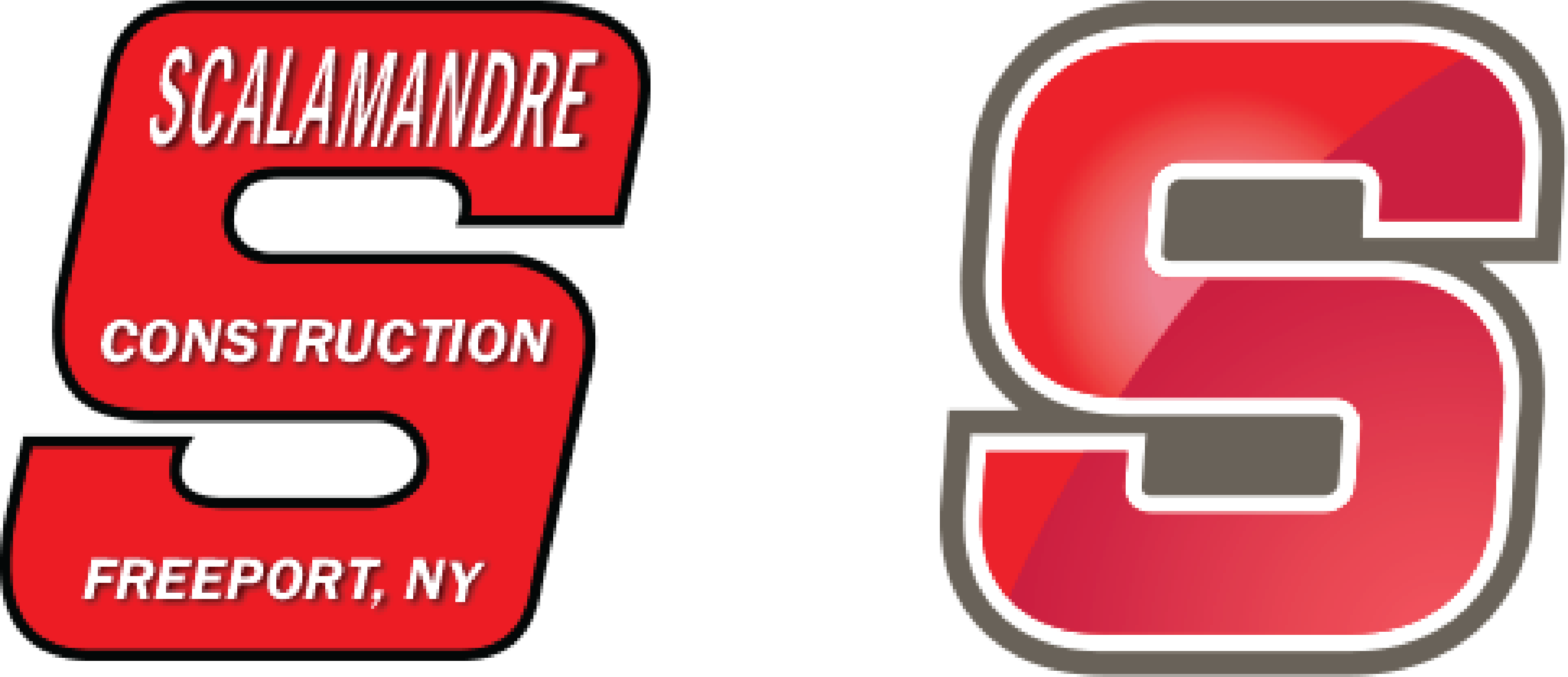
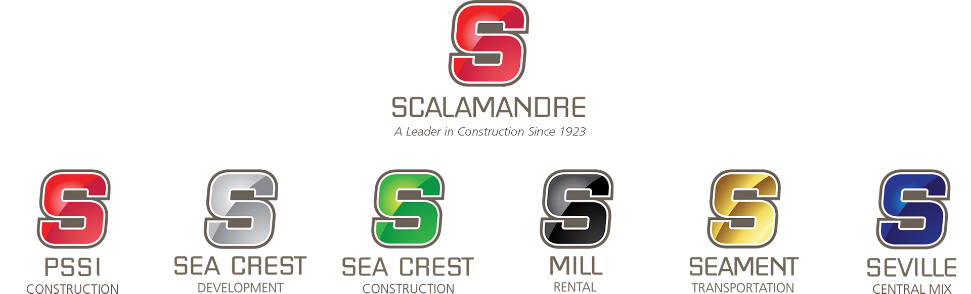
This mark transforms the iconographic ‘S’ into a modernized letterform, similar to an Ivy League letterform that represents a long history of service and tradition, but with a modern twist. The monogram retains the slant bringing forward the legacy of the former ‘S’.
The mark has a constructivist quality that recalls bent forms of steel and construction materials that are put together or a ribbon of process that gets fabricated into what was before, a basic, nondescript shape into a recognizable S-character that represents the almost 90-year-old brand.
It renders well in color and black-and-white, – maintains clarity at small sizes – the hallmarks of a workhorse logo that is well-designed and will stand the test of time.
The color gradation is Scalamandre Red (web: EF4136 – BE1E2D) that can in the darker red as BE1E2D if only one color red can be used in a particular situation or another material color needs to be matched.
The Scalamandre name is custom-rendered in a unique type font that is owned solely by PSSI. It is a modified sans serif that recalls the DNA of the original Scalamandre S. The letterforms have been precisely drawn and spaced for maximum legibility for the character combinations and tightened up (“kerning”) to make the name shorter in physical length than comparable fonts like Eurostile. The more compact the graphic is, the bigger it can be on any graphic real estate.
This new custom font named Scalamandre Sans is used to name the corporate line extensions: PSSI, Sea Crest (C), Sea Crest (D), Seville, Seament, Mill. The idea is to reinforce the super “S” that brings all the extensions together.
The tagline “A Leader in Construction Since 1929,” set in Frutiger (a font originally designed by Adrian Frutiger for the transportation industry) remains nested under the logotype name in italic to support the notion of movement and leadership in a changing business environment.